
BLEACHER BUDDY
Sports fan engagement app
UX Design, Mobile Product Design
Team: John Berry, Kimberly Caras, Joseph Sterling, Hao Wu (with 1 designer and 3 developers)
Time: 01/2018 - 05/2018
Problem Space
For fans watching sports at home, they tend to feel disconnected from the cheering atmosphere that people can feel in the stadium. They do not have a way to interact with the event, much less bring impact on it.
Solution
We presented Bleacher Buddy, a mobile app that provides real-time interactive activities to enhance the TV sports watching experience. The users can participate in the event-specific chatroom, real-time polls and trivia while watching the game. During the commercial break, we provide them with a shake-off cheering competition to make them engaged and root for their team.

Shake-off
Fans at home can join the shake-off during the commercial break. Shake their phone to cheer for their favorite team. The team with most "shakes" win.

Event-specific Chat
Live chat room with other fans to learn their perspective while watching the game.

Polls & Trivia
Interact with the real-time activities organized by a moderator. Participate in polls, trivias and view photos uploaded by other users.
This solution won the 1st runner-up at Georgia Tech's 2018 Convergence Innovation Competition.
Here's the concept video of our product:
My Contribution
User Research: Identified users' pain points by surveys and interviews.
Product Design: Came up with the product features to address the issue.
UX Design: Designed the user interface of real-time activity feed and the interaction of shake-off.
User Testing: Made the evaluation plan and conducted several user testing sessions.
Approach
Brainstorming
Conceptual sketches
Use case storyboard
Ideation
Cognitive walkthrough
User testing session
Evaluation
Research &
Synthesis
Survey
Interview
Competitive analysis
Design & Prototype
Low-fi wireframes
High-fi
Information architecture
Development
Agile method
Research & Synthesis
We published an online survey to gather info about users' sports watching preferences and their phone-using habits. We also had several semi-structured interviews to supplement the data we gathered from the surveys.
Here are the insights we found from our research:
1. Need more fans engagement for people watching sports at home.

Based on the survey, nearly 80% of our respondents usually watch sports at home. And 68% of them think their sports watching experience should be improved.

We conducted interviews to further specify the reasons why they're not satisfied with the current sports-watching experience. We listed the most common keywords they mentioned:

Based on what's above, we concluded that the major pain points of the users are:

Can't Cheer for their team
The users can't feel the cheering atmosphere and have difficulty bringing impact on the game by watching at home.

Hard to interact with other fans
The users feel hard to interact with other sports fans and feel nobody they can chat with while watching on TV.

Can't participate in in-game activities
The users can't participate in the in-game activities which are only available in the stand, like kiss cam.
2. People tend to use smartphones while watching sports, especially during the commercial break.

Our interviewees pointed out that current solutions to their frustration are attending a viewing party or chatting with friends via smartphone. However, only 3% of the respondents usually watch at the viewing party.

84% of the respondents claimed that they had used smartphones while watching the games.

Lots of people mentioned they used the phone to text and chat during the game. And the most common time to use their phone is the commercial break.
The research helped us identify the pain points. And it inspired us to use mobile phone and activities during the commercial break to address the issue.
Persona & User Journey Map


Competitive Analysis & Similar Apps
In order to come up with our solution, we decided to conduct competitive analysis to collect inspirations.


VOLE
It is a social media platform for soccer fans. In this application, the user is able to view other people’s opinions, news articles, photos and polls. In addition, they are able to connect with their friends and strangers who also support the team.
Shortcoming: It's not specific to TV watching experience. It also does not allow soccer fans to directly impact the game.
Source:
https://itunes.apple.com/us/app/vole-sports-social-network/id1186752997?mt=8

ROAR
The app features four main activities that fans at the game can initiate and participate in: getting the crowd to say the same cheer at the same time, getting the crowd to sing along to a song together, creating a pixel poster in the crowd using their phone screens, and starting a collective crowd motion (clapping and “the wave”).
Shortcoming: There's no way for fans watching TV to participate in. Since it's a class project, we don't know how much success they achieved.
Source:
http://www.hirundino.com/#/roar/


Bilibili Danmu
The Chinese video website Bilibili's most recognizable feature is its danmu, a user conversation system where time-synced comments are overlaid directly on top of the video as it plays. The danmu system creates a viscerally social watching experience: during pivotal moments in a video, reactions wash over the video in a dense tidal wave, often covering up the source material entirely.
Shortcoming: It's not suitable for TV watching. The comments would be too overwhelming if millions of audience watch and comment together.
Source:
https://medium.com/magpie-digest/social-appeal-of-bilibili-c2b41af5cd31
The current solutions inspired us to focus on creating real-time commenting and collective activities for the fans. But we still need a way to engage fans at home in a collective cheering activity for their favorite team. Then we moved on to ideation sessions.
Ideation
Based on the research, we defined our design goals as below:
1. Create a mobile-based interactive experience, as a complement to real-time TV watching experience and a substitute of the commercial break;
2. Create collective activities for fans engagement and interaction;
3. Bring the competitive energy into TV watching experience, which can provide an approach to allow the users to bring their own cheering impact at home.
Then we moved on to the ideation sessions. All of us sat down together to come up with interactive activities that can meet our design goals. We summarized them into three main categories: real-time interactive activities, event-specific chatroom, real-time stats.


But we still need to have an activity to make users feel like they're cheering. We tried to create a team-based cheer-off during the commercial break. We believed the physical interaction would better release people's excitement of cheering. Since the smartphones can sense when it's being shaken, that's an intuitive physical interaction that users can have with their phones. So, we decided to create a shake-off for them to cheer.

Moderator

Sports fan
To make the activities real-time and specific to the events, we need to involve a new group of people, the moderators, to create activities and organize the online communities. The moderator can publish polls, trivia and initiate shake-off.
In conclusion, the features we envision the app should have are:
1. Real-time interactive activities (polls, trivia);
2. Event-specific chatroom;
3. Shake-off Cheering;
4. Real-time stats (due to time limitation, it was not designed and implemented).
Concept Storyboards
Shake-off

The user is watching sports alone at home.

The moderator initiates the shake-off activity and the user gets the notification. Then he/she is instructed to shake to gain points for the team he/she is supporting. The real-time shaking score of two teams is shown in the app.

The user is very excited and want to cheer. Then it's the commercial break.

The user shakes his/her phone quickly. The team with the most "shakes" wins the shake-off. The users who support this team can get rewards.
Real-time chatroom and activities

The user is watching sports alone at home.

It turns out to be a home run and the user becomes so excited.

The user sees the player made a long hit.

The user wants to share his/her happiness but he/she is alone.

The user opens Bleacher Buddy and finds a lot of discussions about this home run. And also there's a poll about who's the best player in this game. He/she immediately joins the discussion and vote in the poll.

First, users choose the live game.

Then they need to choose a team that they want to support. They can also enter as a neutral fan if they want.
Final Visual Design

Prototype
Please feel free to click through the prototype below! (Prototyped by Adobe XD) Some functionalities are not available for the current version.

Design Iterations
After determining the features of our app, we drew the information architecture of the app.

Since we have two designers on our team, we picked on different feature flow to work on. Then we got back and presented our own work to each other. We critiqued each other and wrap them up together. My design mainly focused on Real-time Interactive Activities and Shake-off.
Design for Real-time Interactive Activities Page
I tried two layouts when I designed for interactive activities. In the first one, I categorize the activities into subpages: polls, trivia, and pics. Users can switch the tabs to view different activities.
However, the first layout can't reflect the real-time experience that the users will have when watching TV. Because all activities are separate and users won't know which one is the latest activity responding to the live game.


Then I referred to Twitter's and Facebook's timeline feed design. I integrated all kinds of activities into one page together. List them in a time order. The latest post would be at the top. In this way, users can know which one is related to the latest progress of the game.
Here's the final version of this feature. In order to keep up with the game, users can drag the page down to refresh.

Design for Shake-off
As we introduced shaking your cell phone to cheer for your team, we also needed to design a flow to teach users about this new concept and interaction. First, we need to make sure the shake-off makes sense to our users. Then we also needed to design reasonable feedbacks to make users won't get lost while switching between physical activities and their mobile screens.
The diagram below demonstrates the interaction flow, design challenges, and my solutions:


Visual Design

Current status and suggested Interaction
Help icon: explain how shake-off works
Icon suggesting next interaction
Explain what you can expect if you do the interaction mentioned above
Current score: help users realize their goals
While users are shaking their phones, they won't see the phone screens. But it will turn to this screen when they stop shaking and look at the phone again.
Your contribution stat
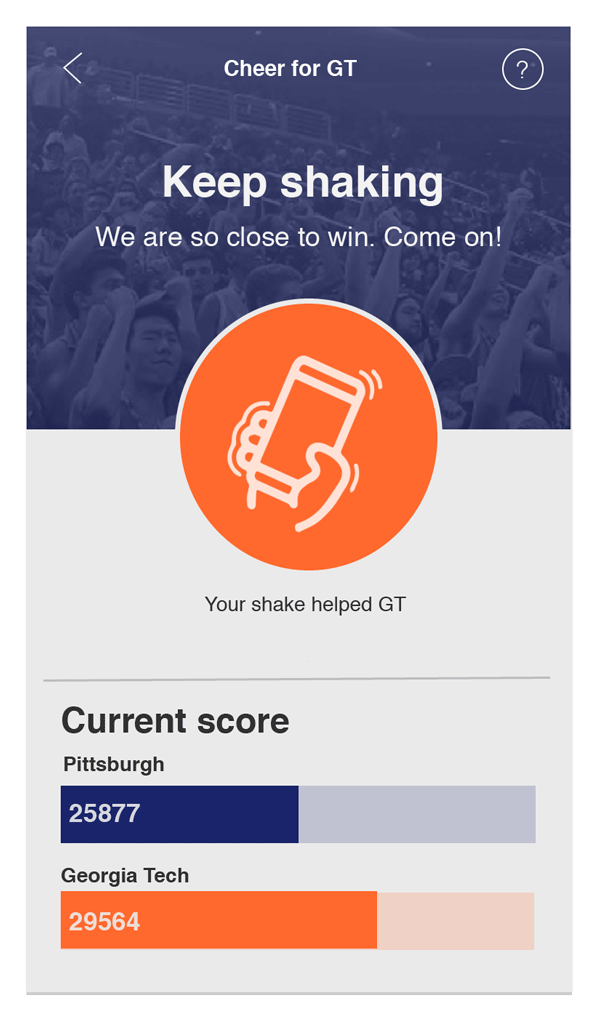
The animation here suggests that your shake contributes the gain in scores

When the team you support wins

When the team you support loses
Let Users Know When to Join Shake-off
The shake-off activity is only available at a specific time. It is initiated by the moderator. Usually, we envisioned that the moderator will start the shake-off during the commercial break. Then the users can get notifications to ask them to join.
Here are several states I designed for shake-off:

When the shake-off hasn't started, the interface is like this. Users can turn on the notifications to get notified when it starts.


When the shake-off starts, users will see a banner at the top. They can click the banner to get to the shake-off tab directly. And the "Cheer" tab will turn to orange.
Moving Towards Final Version
After I finished my part of the design, I had a meeting with the other designer. We talked about my design and his design. We critiqued each other and then finally organized all of the wireframes together.

User Feedback Session
We conducted a user feedback session after we finished our wireframes. We invited 5 potential users to walk through the wireframes and asked them follow-up questions.
We figured that the basic interaction flow makes sense to the users, especially our testers can understand the interaction of the shake-off.
However, when asked about their sense of engagement in the game, some of them thought they needed a stronger affiliation with the team they root for.
In the current design, the shake-off is the only activity that requires users to identify which team they support. In general page and chat room, users will read about both of the teams in the game. Some testers said they wouldn't want to read polls or trivia about the opponent team which they might not be interested in or familiar with. And we realized putting fans of both teams on the same channel might end up with troll comments and quarrels.
In this way, in our design iteration, we decided to ask users to choose the team they support before they enter the live game room. After choosing their affiliation, they will be more likely to read polls and trivia about their team and chat with the fans on their side.
Evaluation

Cognitive Walkthrough
We divided the tasks we wanted to test into several steps. Then we recruited three UX experts to perform each task and answer questions against usability criteria.

Benchmark Test
We asked 4 users to interact with our app and observed if they can complete the given tasks. Users are required to follow the task flow and critique every screen using the think-aloud methods. We recorded their success rate and satisfaction rate.

Follow-up Interview
After the experts and testers tried our prototype, we asked them a series of questions to document some qualitative data about their preferences.
Tasks we tested on:
1. If users can successfully cheer for their team by shaking;
2. If users can select the live game room and identify themselves as a Georgia Tech fan;
3. If users can switch among the general page, chat room and shake-off.
Our testings found that this interface is easy to use and understand. It has a 100% success rate and the average satisfaction rate is 6.5 out of 7.
However, there were still a few tweaks we should make after the testings.
Users indicated they felt hard to find the date quickly by clicking the arrows.
Users were confused with the meaning of "TBS" since it was too close to "4min ago".

Users were confused if this was the ending in this activity. They were not sure what they should do next.
Here is our new version of these two screens:

We added a calendar icon at the top. Users can click it to open a date picker. We also moved "TBS" to a new line.

If users stay at this page for too long, a tooltip will automatically pop up at the top to tell users that they can quit.
As of here, our design work has been accomplished. Then we handed it over to the developers. Due to time limitation, not every feature has been implemented.

